Product overview
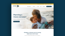
DASA is renowned as the longest established moving company in the UAE, having built a formidable reputation as a leading provider of international relocation solutions.
The problem & objective
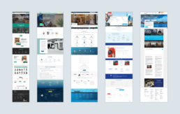
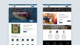
The current website was disjointed, unprofessional and did not successfully communicate their offering or build trust.
The initial objective was to perform a usability audit (over 2 days) to determine what could be addressed to improve the user experience and ultimately lead to more enquiries.
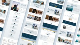
From there, we then went onto design and build a completely new site, keeping the business and user goals front of mind.
The scope & constraints
This project was split into two parts: 2 days for the audit and just 5 days for the design.
The delivery date was set in stone due to an industry networking event which the client needed the new site for. This ensured we had to work quickly and efficiently, only spending time on the absolute essentials to get the site live in time.
The solution
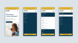
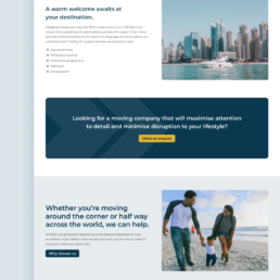
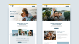
Within the time limitations we were able to radically improve the site’s user experience, establishing trust with users and positioning DASA as a well-respected and industry leading provider.
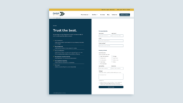
- Successfully elevated the international relocation service, focusing on guiding users to ‘make an enquiry’ through a focused and accessible form.
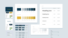
- A basic design system was established, providing consistency and alignment across all styles and components, all to accessibility best practices.
- Increased levels of trust through revamped content, humanising imagery and elevating world class accreditations.
Kick off & discovery
To kick off the project we sat down with the client to get a better understanding of their business and their objectives for the site.
We discovered that the core business objective was to increase the number of quality leads for their international relocation service.
They also wanted to build trust through effectively communicating their 40+ years in the industry and their industry accreditations.
From the kick off meeting we were able to establish the following about their users:
- DASA’s primary users are western, general expats looking to relocate themselves, their family and often, their pets.
- They will come to the site via a Google search, a blog post or social media.
- They may be considering DASA in addition to 3-4 other companies for their relocation needs.
- They are looking to see what services DASA offer, as well as gaining an understanding of the company and whether or not they should trust them with what is an emotional and life-changing move.
- Ultimately, users want to get in touch to discuss their needs and get a quote.
- Secondary users include relocation agents and those requiring special projects such as relocating large machinery.
Usability audit
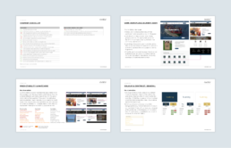
I performed a comprehensive usability audit to analyse the current site and establish what would need to be prioritised for the initial design phase.
This audit took a deep dive into the site across the following categories: content, labelling (information architecture), interaction, feedback, visual hierarchy and design, forms and accessibility.
Key findings from the usability audit:
- Content needs to be considered, both in terms of text and imagery to ensure its appropriateness for both the business and user.
- Information architecture, including labelling, primary navigation, in page navigation (breadcrumbs, workflows) and search functionality all need to be considered to ensure flexibility, clarity and consistency.
- All interactions and feedback need to be looked at to ensure clarity for the user.
- UI styles need to be set including a grid, colours and type scale in addition to core UI components including button styles, form fields and so on.
- The form needs to be addressed in terms of its labelling, feedback (errors), mandatory and optional fields etc.
- Accessibility issues need to be addressed to ensure usability for all users.
Competitor benchmarking
As part of this initial audit process, I briefly looked into DASA’s main competitors to get a better understanding of what was in the space.
This was very much a top-level look as this was not quoted for as part of the audit job. However, I felt it was important to at least do some basic research to help inform the next stage.
Key findings from competitor benchmarking:
- Quote forms are featured immediately, from the home page header as well as being accessible from the navigation and footer.
- Accreditations & reviews featured on home pages to build trust.
- Frequently asked questions sections.
- Service areas split by type, i.e. commercial, domestic.
- ‘How it works’ section utilising illustration or iconography to demonstrate the moving process to a customer.
- Feature related content/resources at the bottom of service level pages.
- Detailed moving guides for each country including information on VISAs, cost of living, housing, healthcare, taxation, education, best cities and FAQs.
- Language focused on ease and quality of experience.
- Quote form include the option to add exactly who and what you are planning on moving i.e. no. of children, house size.
Prototyping
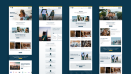
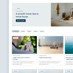
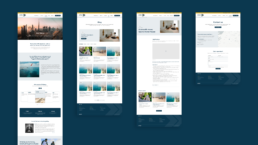
With a tight timeline of approximately 1 week, armed with all of our findings up to this point, the site map and key content requirements, I jumped straight into high-fidelity prototyping.
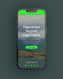
The objective was to focus on designing the 8 core pages whilst working with the pre-existing colour palette, logo and general visual identity.
Key learnings & next steps
Some of the key learnings throughout the project were:
- When working to an immovable deadline, be sure to effectively prioritise impact vs effort in terms of both design time and build time.
- Even with a short project duration, starting off as you mean to go on in terms of a basic design system can be incredibly valuable.
- When working at speed, it is even more essential to have the user and business goals front of mind at all times, ensuring that time is spent wisely in the most important areas.
If I was to continue working on this particular project, some next steps would be:
- Consider bringing the enquiry form into the home page header and how this would work.
- Add further service pages (pets, local/domestic and office) and consider how to clearly separate commercial and domestic services.
- Add Google reviews to further build trust.
- Add moving guides, focusing on their most popular countries first, with an emphasis on moves to the UAE.
