The problem & objective
Luxury developer Kebbell required a new identity and brochure design for Alderbrook, their new collection of 85 homes set in the heart of the South Downs National Park.
This identity needed to stand out from local competitors and reinforce Kebbell’s profile in the area.
The solution
The development messaging, identity, location photography and brochure perfectly encapsulates the development and all of its benefits to potential buyers.
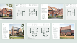
To meet the client requirement of reducing paper usage, digital floor plan sheets were designed which also maximised flexibility of use for their sales representatives. The identity elevated Alderbrook, positioning it firmly as a high-end, highly desirable collection of homes, with phases selling out quickly.
Development language
Following extensive research including competitor analysis and a site visit, I developed a story and strapline that would go on to inspire the visual identity and brochure.
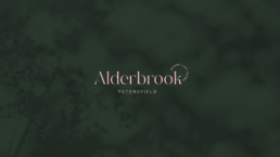
The beautiful countryside setting along with its local brook and flowing river led to the theme of ‘Where life flows’. This provided a thread from which all further work was based upon.
Developing the visual identity
With the newly established story in place, I was able to begin developing the visual identity.
Multiple logo designs, colour palettes and typographic possibilities were explored, all communicating this idea of flow. The final logo is elegant, yet modern, with a flowing, organic typeface that portrays this perfectly. Meanwhile, the strapline encircles the wordmark, illustrating the idea that to live here is to truly be surrounded by nature, the key selling point of the site.
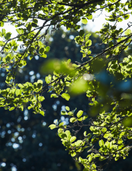
The colour palette is led by a deep, sophisticated green that links back to the surrounding landscapes. A secondary natural green compliments this, along with an unexpected light pink highlight that represents luxury living.
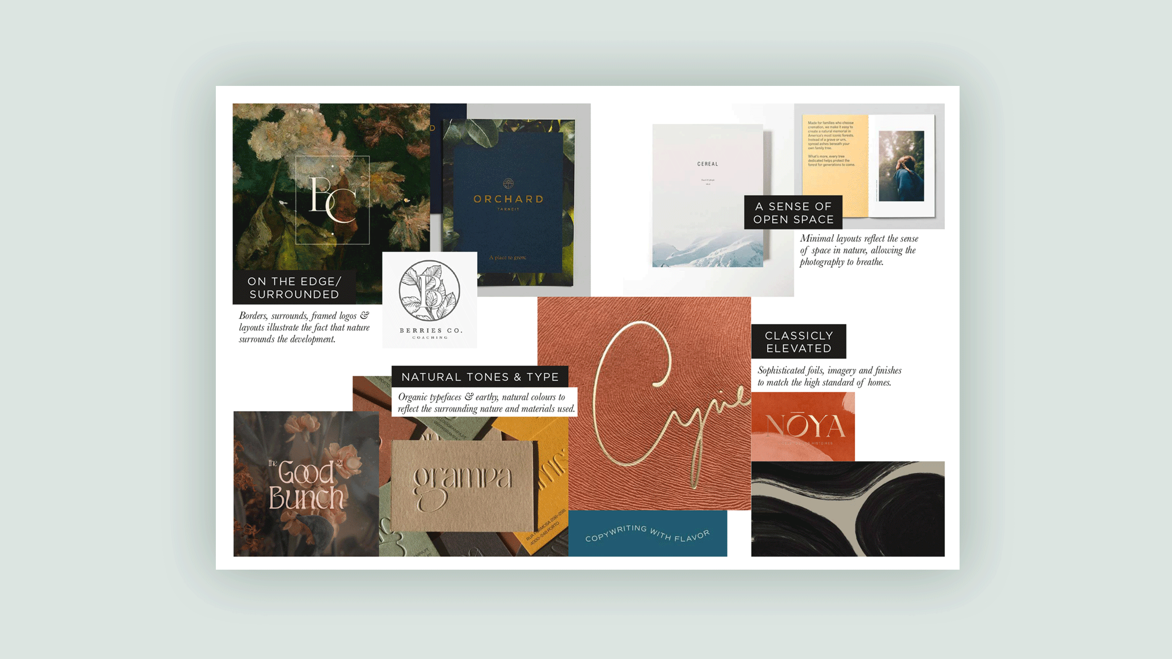
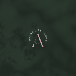
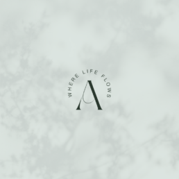
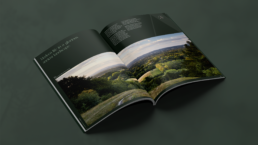
Photo shoot direction
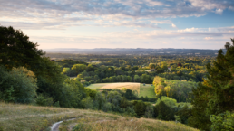
Local area photography was required to support all marketing efforts and showcase the beauty of the site’s location.
A comprehensive photography brief was written to provide creative support and direction, ensuring all local amenities would be perfectly showcased.
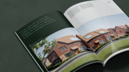
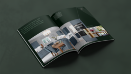
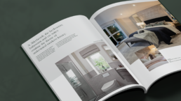
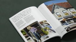
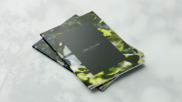
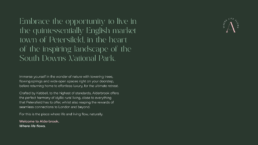
Brochure design
A printed host brochure paired with digital floor plan sheets work seamlessly together to showcase Alderbrooks offering.
The brochure design communicates the surrounding nature through framing and use of colour. Meanwhile, the symbol from the logo is used as an oversized graphic, providing layering and further framing. Photography overlaps to further communicate the idea that to live here means to be immersed and surrounded in nature.