Product overview
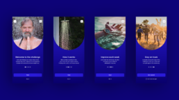
The Wim Hof app provides users with the tools they need to begin the Wim Hof method, a methodology created by Dutch extreme athlete Wim Hof, which is based around the three pillars of breathing, cold therapy and commitment.
Believed to have wide-ranging health benefits from increased energy to an improved immune system, the app offers users cold shower challenges, guided meditation sessions, exercise demonstrations and more.
The problem & objective
Currently, new users struggle to see the value of taking a daily cold water shower and find motivation to continue their routine.
The objective was to research, strategise and design an improved experience, making it easier for new users to customise, complete and track their cold shower challenge and upgrade to a paid subscription.
Scope & constraints
This project was to be completed in 5 weeks as part of the UX/UI bootcamp with Memorisely.
The timeline was short when factoring in all classes, workshops and full-time work, meaning we had to work efficiently, prioritising the most effective steps and most impactful changes.
The solution
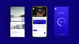
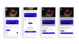
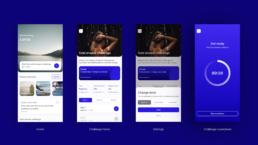
The solution was a simplified and improved experience, addressing the fundamental issues that we discovered across styling, navigation and hierarchy.
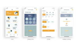
- Elevated the cold shower challenge on the home screen and enhanced UI styles to address hierarchy and clarity issues.
- Improved the confusing settings options and user journey, allowing for a more seamless experience.
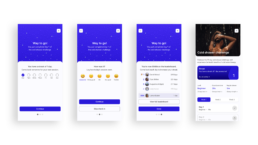
- Added features to encourage repeat use including reminders, streaks, check ins and a community leaderboard.
Process deep dive
The following sections outline the process that we went through to reach our solution.
Following the Design Thinking process, we began with a usability audit of the current user journey, followed by competitor benchmarking. We then went on to define the problem before ideating on possible solutions, prototyping and testing. Throughout the process we made sure to always be mindful of both the user wants and needs and business goals.
Empathising with the user
Before diving in to conceptualisation, it was fundamental that we gained a better understanding of the current problem, the user wants, needs and expectations.
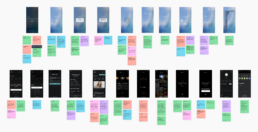
With the time constraints set on us, we decided to focus on a usability audit of the current user journey and competitor benchmarking to give us a better understanding of the products in a similar space and how we can use that information to improve our upcoming solution.
Key findings from the usability audit:
- The lack of hierarchy on the home screen did not highlight the 20 day cold shower challenge, or include any information on the premium subscription.
- There are multiple points throughout the journey that lack clarity, including the shower challenge screen and settings screen, causing frustration.
- The UI styles all need considering to ensure that they’re consistent, appropriate and reach accessibility standards.
Key findings from competitor benchmarking:
- Minimal visual distractions on the screen whilst performing the actual task (cold shower) allows the user to focus.
- The use of clear, instructional language is key, ensuring the user knows what is going to happen and what they can do.
- Customisation options allow for a more personalised experience, however too many could possibly overwhelm, or even frustrate the user.
Define & ideate
With the defined problem fresh in our minds, we utilised various ideation techniques to explore ideas on how we could improve the experience, including mind maps and rapid sketching.
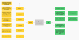
There were a lot of elements that needed improvement, some of which were simpler to address than others. In order to utilise our limited time in the most efficient way, we utilised a priority matrix, which resulted in the following priorities:
- Improve the hierarchy on the home screen to ensure the cold shower challenge is the most prominent.
- Improve the confusing navigation and settings screen.
- Improve upon the type and colour styles.
- Add follow up screens including streaks, mood check-in and community leaderboard.
Improving the user flow
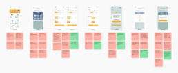
After mapping out the current user flow, identifying key problems within it, we worked on creating an improved version that would allow for a more seamless experience.
Low fidelity prototyping
Pulling together everything we had learnt, we began sketching out low fidelity wireframes that would inform our prototype creation.
Prototyping
Now that we had done all of our research, defined the key problem and ideated on solutions, we were ready to begin the design phase.
Knowing our focus was this specific user journey, we focused solely on that to ensure we made the most of our time to create an interactive, animated prototype from which we could test.
- Defined UI styles
- Created key components
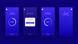
- Prototyped each screen, including interaction and animation
Remote usability testing
To gain insight into the prototype directly from users, I conducted a remote usability test using Maze.
Some of the key insights gathered during the testing were:
- Users generally found it simple and easy to use.
- Users appreciated that nothing unnecessary was added, which made it easy to navigate and complete tasks.
- Users liked that they could check in and see other people’s sessions via the leaderboard.
- Some users would have liked more flexibility in the way they could swipe through the steps.
- The average time spent on screens across all tasks was rated as perfect.
- Whilst the usability score of most screens was over 85%, the challenge screen was 70%, leaving room for further improvement.
Key learnings & next steps
Some of the key learnings throughout the project were:
- Make sure to keep going back to the root problem to stay focused.
- Remaining open to feedback throughout the process from both users and those in the team will ensure the best result.
- Starting as you mean to go on in terms of setting up styles and components well will save time in the long run.
- Don’t spend too long on the first idea, sometimes it’s just a stepping stone to a better one.
If I was to continue working on this particular project, some next steps would be:
- Explore how to differentiate between the cold shower screen (the challenge itself) and the countdown and regular shower screens.
- Explore how to make the play/start challenge button even clearer on the challenge screen.
- Explore the use of illustration or iconography in place of photography.
