Product overview
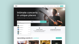
Sofar Sounds is dedicated to curating intimate concerts in unique spaces, bringing undiscovered artists to live music fans in 400 cities across the world.
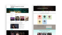
With a mission to re-imagine live music events, Sofar Sounds events combine unique venues (including museums and rooftops) with 3 undiscovered surprise artists for an unforgettable experience. The website includes the functionality to search for events, book tickets and gives a taste of what kind of artists users may discover.
The problem & objective
Currently searching for available events is very limited with only a single dropdown menu.
The objective was to research, strategise and design an improved search experience, making it easier for new users to search and filter for local events, ultimately resulting in increased bookings for Sofar Sounds.
The scope & constraints
This project was to be completed in 5 weeks as part of the UX/UI bootcamp with Memorisely.
The timeline was short when factoring in all classes, workshops and full-time work, meaning we had to work efficiently, prioritising the most effective steps and most impactful changes.
The solution
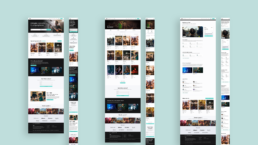
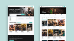
Within the time limitations we were able to improve the search functionality and filtering options, resulting in a more user-friendly experience.
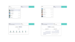
- Increased search metrics to include dates, allowing for greater user customisation and more appropriate results.
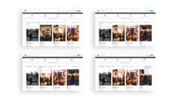
- Additional and improved filters on the results listing page, as well as ‘sort by’ functionality.
- An improved event card, now clearer, including a rating and video hover state.
Process deep dive
The following sections outline the process that we went through to reach our solution.
Following the Design Thinking process, we began with a usability audit of the current user journey, followed by competitor benchmarking and user interviews. We mapped the information architecture and improved upon the user flow before ideating on possible solutions and prototyping. Throughout the process we made sure to always be mindful of both the user wants and needs and business goals.
Empathising with the user
Before diving in to conceptualisation, it was fundamental that we gained a better understanding of the current problem, the user wants, needs and expectations.
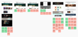
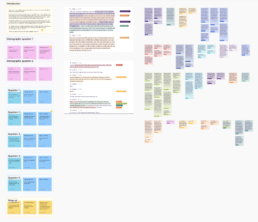
We prioritised a usability audit of the current search experience, competitor benchmarking and user interviews, all of which gave us key insights into how to improve the experience.
Key findings from the usability audit:
- Immediate access to the search from the home page is great, however there is currently only one search metric (location) which is limited.
- The filters on the event listing page would benefit from additional metrics such as price and a ‘sort by’ dropdown.
- There are missed opportunities to include more imagery and/or video, especially on the event listing cards.
Key findings from competitor benchmarking:
- Multiple filter types (i.e. location, date, price) in the initial search bar are great as they refine the search, increasing efficiency.
- Narrow filters are helpful, but so is the ability to view lots of results through options like ‘I’m flexible’. Utilising both allows for users who know exactly what they’re looking for as well as those who are browsing more freely.
- Event cards need to be simple yet contain all of the core information needed to make a decision such as location, price, date, time, image (or video) and reviews (5*).
Key findings from user interviews:
- Primary frustrations around searching for events online included: a lack of clear pricing, lack of clarity around how and when you get your ticket, lack of clarity around refunds and a lengthy process to get to the checkout.
- Filters that are deemed most important include: location (both venue and town/area), date, price (with seat types) and music genre.
- Participants generally used laptops to browse and purchase tickets, but then wanted good mobile access to their tickets with the ability to add tickets to Apple wallet.
Mapping the information architecture
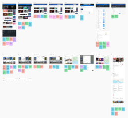
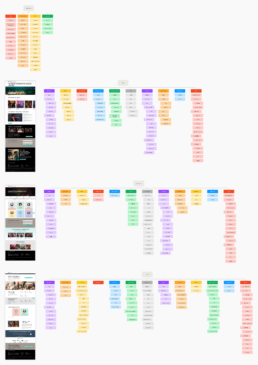
Through mapping out the relevant pages of the site on a page, section and component level, we established the content, structure and hierarchy.
Improving the user flow
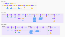
After mapping out the current user flow, identifying key problems within it, we worked on creating an improved version that would allow for a more seamless search experience.
Define & ideate
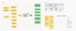
With the defined problem fresh in our minds, we utilised various ideation techniques to explore how we could improve the experience, including mind maps and rapid sketching.
In order to utilise our limited time in the most efficient way, we utilised a priority matrix, which resulted in the following priorities:
- Improve the search bar options to include: date (exact, month, ‘I’m flexible’) and location.
- Add filters for price ranges, reviews and a ‘sort by’ dropdown to the results listing page.
- Improve the design of the event cards to include price, reviews and imagery/video.
Low fidelity prototyping
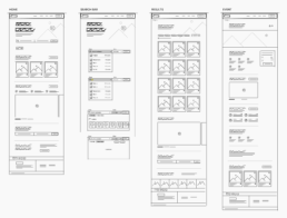
Pulling together everything we had learnt, we began sketching out low fidelity wireframes that would inform our prototype creation.
Prototyping
Now that we had done all of our research, defined the key problem and ideated on solutions, we were ready to begin the design phase.
We focused our efforts on the search flow, rather than making significant changes to the core UI styles, ensuring we made the most of our time to address the key problem at hand.
- Created key components
- Prototyped each screen, including interaction and animation
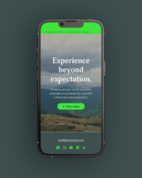
- Created both desktop and mobile layouts
Key learnings & next steps
Some of the key learnings throughout the project were:
- Ensure to remain focused on the problem at hand, rather than trying to improve everything all at once.
- Listening to users directly can provide you with answers (and interestingly, more questions) that you may have never thought of.
- Quick wins for improving accessibility can make all the difference, such as changing the wording on buttons and tweaking interactive states to be colour independent.
If I was to continue working on this particular project, some next steps would be:
- Facilitate usability testing to establish the success of our changes and highlight any areas of further improvement.
- Explore how we use video and especially audio, to enhance the experience.
- Explore adding more options in terms of how a user can search, possibly by adding a map view.
